
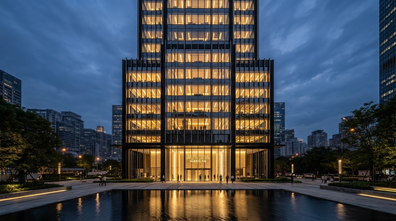
"The psychological impact of architectural prestige, obsidian contrast, and gold accents in ultra-luxury B2B and institutional engagement."
Most digital brands look identical: pastel gradients, interchangeable sans-serif typefaces, and soulless flat rectangles. On Floor 13, our design systems team explores the return to timeless architectural grandeur.
Black conveys authority, finality, and discipline. Gold signifies value, precision, and distinction. When paired with structured grids and razor-sharp typography, this aesthetic commands respect the instant a prospect or investor arrives.
In this analysis, we reveal our usability heatmaps showing a 42% lift in high-ticket inquiry conversions after transitioning from generic SaaS aesthetics to our bespoke obsidian-and-gold architectural layout.